Canada
PM | PO | UI/UX
E-Commerce
2022
Delivered Product
Background
About SponsorPulse
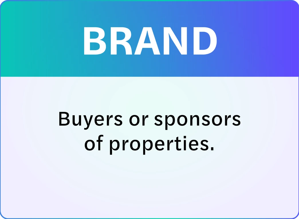
SponsorPulse is a platform that provides valuable consumer data for brands and properties to build strong connections through sports and entertainment. The user can view, analyze and use the data, while generating reports on it.
The Problem
The number of products indexed in SponsorPulse wasn’t reflected in the product. The user wasn’t able to take advantage of the number of possibilities that the service was actually providing. How to optimize the content, improve the user experience, and put the user at the center was an unanswered question. And the cost of not knowing was affecting rentability.
Project Overview
The Challenge
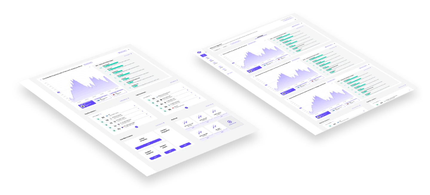
As a team, we faced the challenge of redesigning a successful and short user login process. The Onboarding had to take the user to different dashboards and views adapted with features.
Our Goals
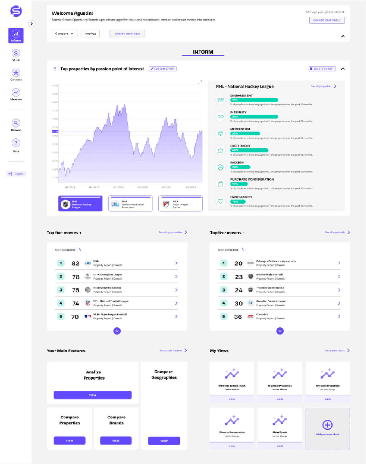
Redesign the SponsorPulse user experience with a focus on an intuitive and dynamic flow of information which takes into account the points of interest of each user.
Timeline
Understanding Our Users
a/ Key User
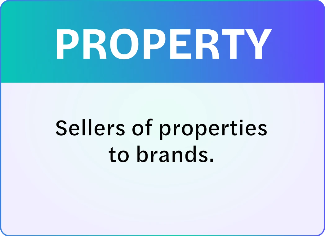
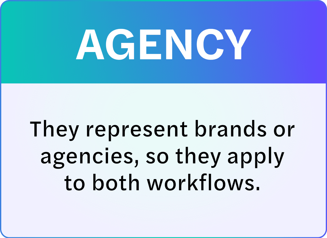
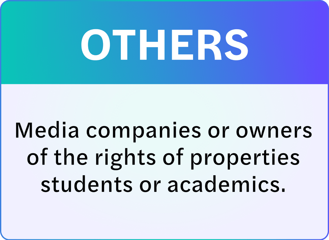
b/ Competitor Analysis
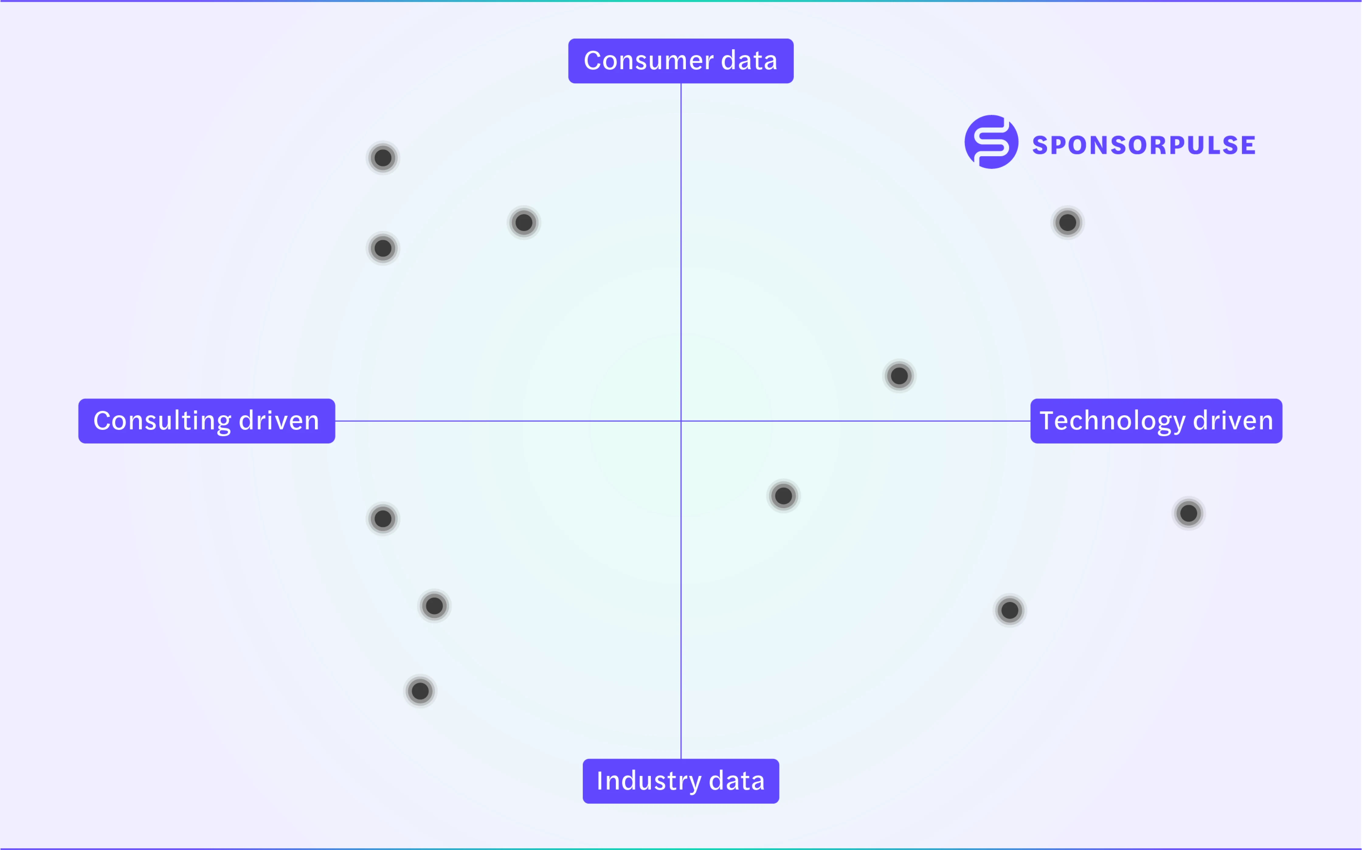
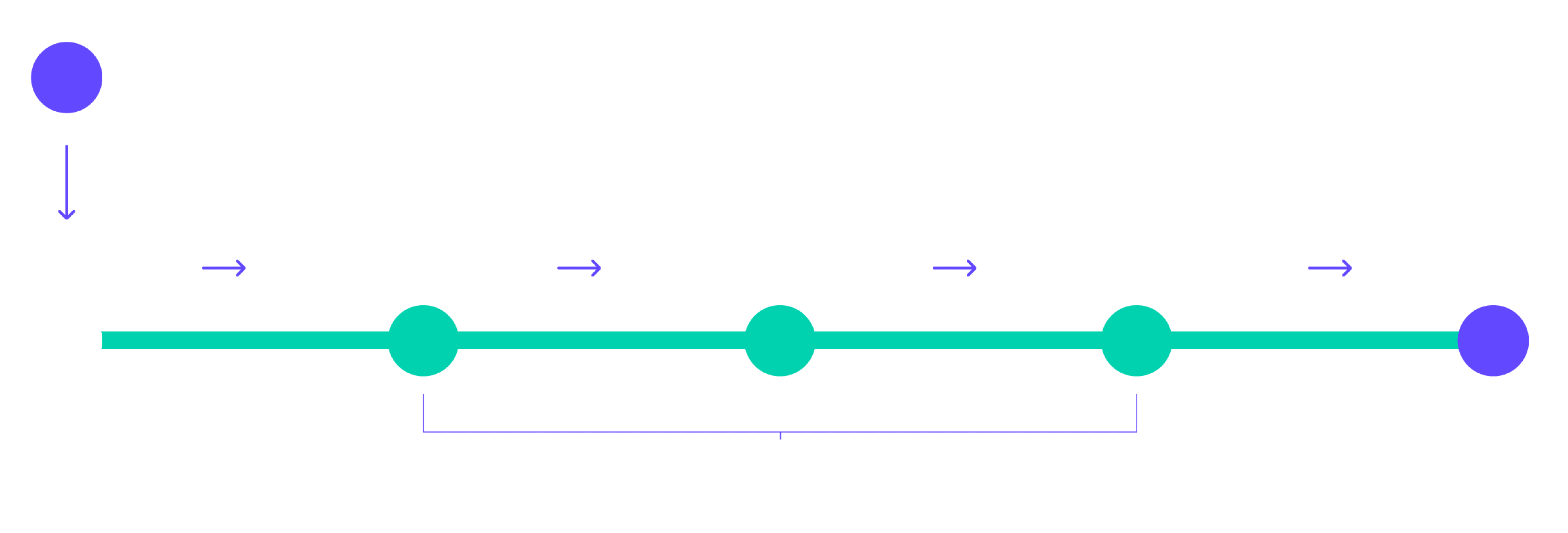
c/ User flow
Ideation and Design
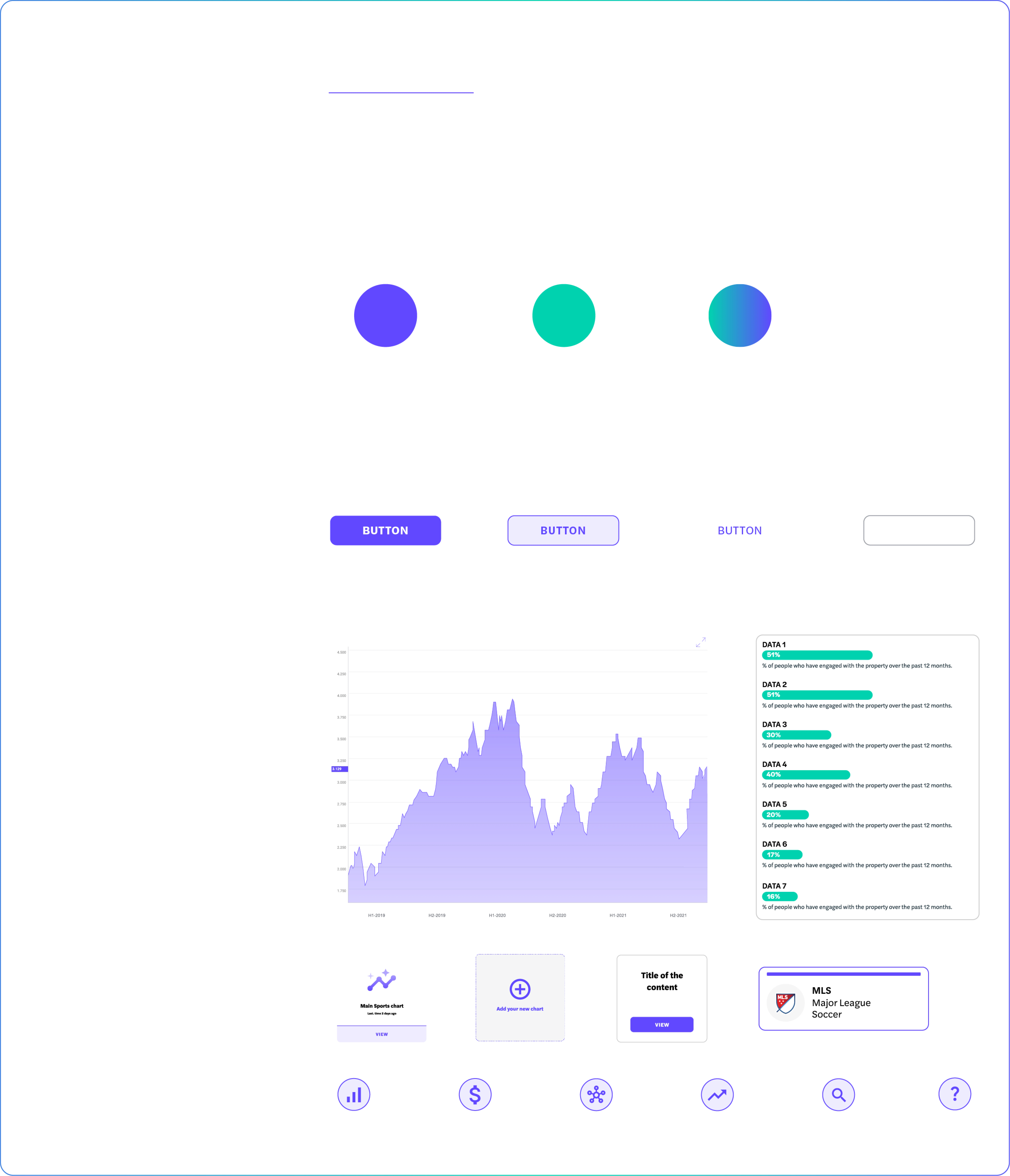
a/ Style Guide
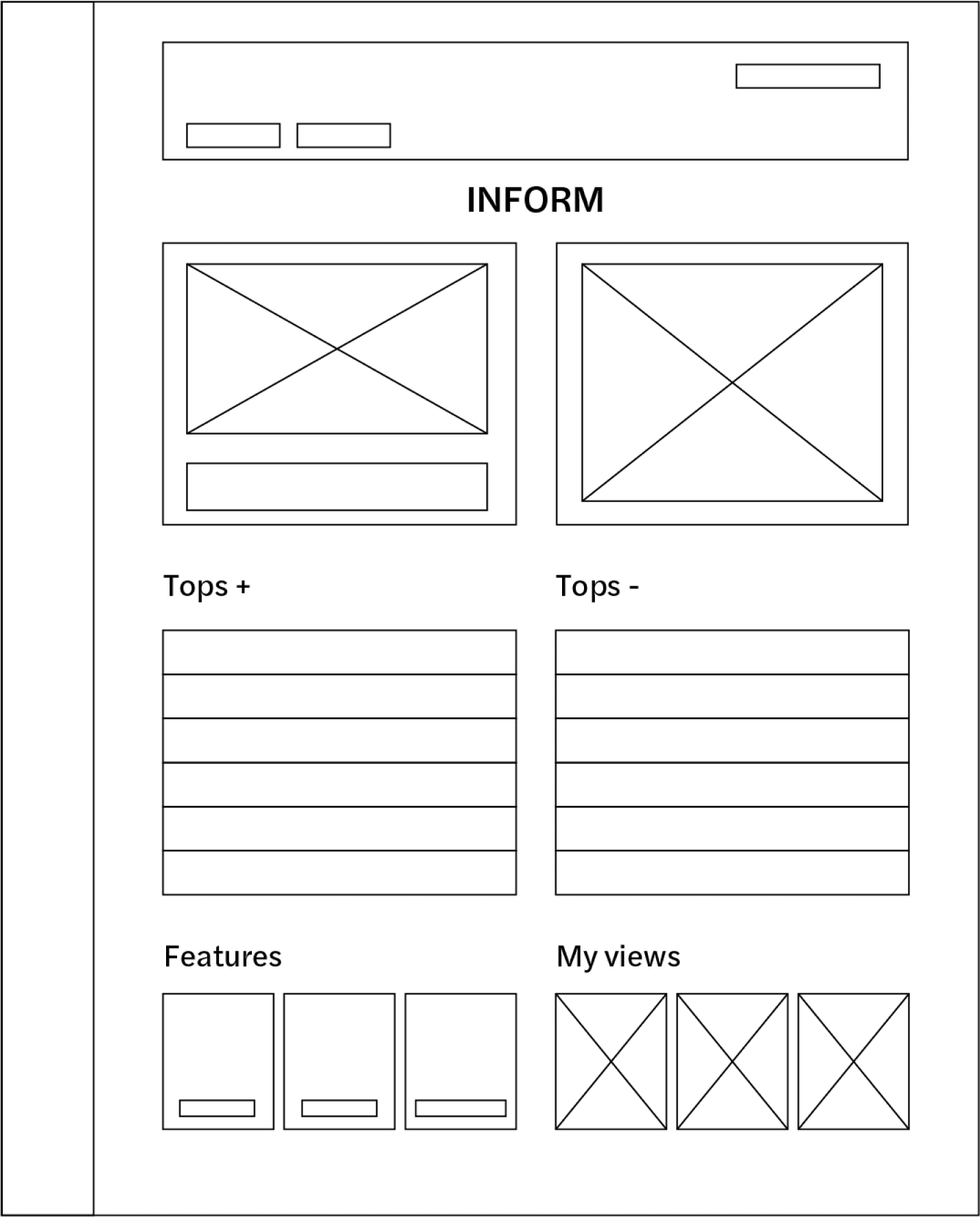
b/ Wireframes
Low-Fi
Mid-Fi
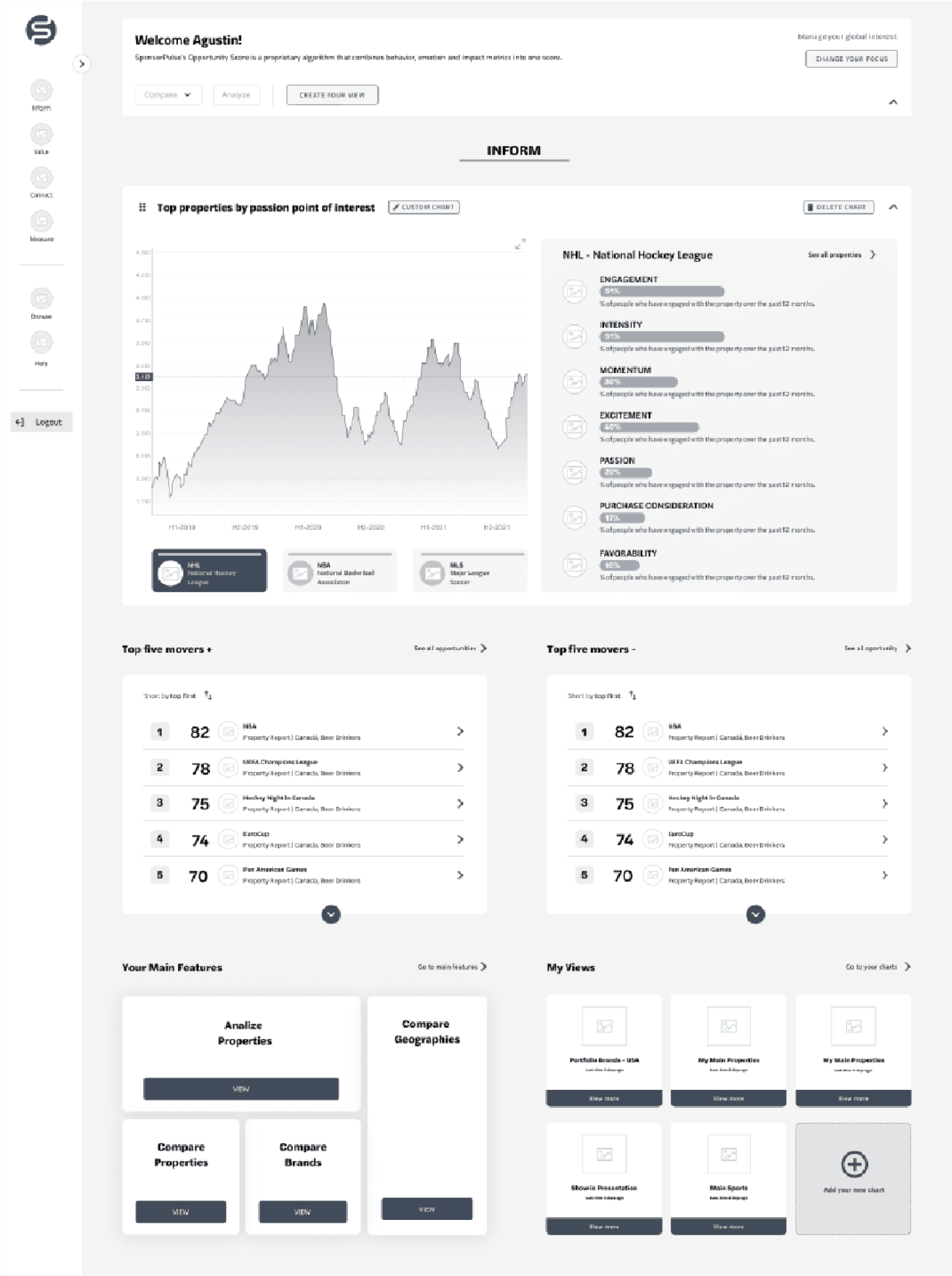
Hi-Fi
Final Proposal
Navigation
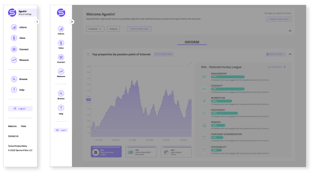
We worked on the redesign of the site navigation in the sidebar to make it as simple and clean as possible. When you open this sidebar, it gets a bit bigger and shows the account settings and the links below to contact. Then, the users can get more information about the company in the footer.
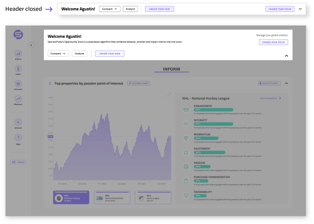
Header
We designed a main header with the most important features of each dashboard offering the possibility to customize the data loaded in the onboarding. This Header is at the top of the site and it can be collapsed to make it look smaller.
