#AudioOnline
When Music Meets UX

United States
PM | UX
E-Commerce
Feb 2021 - Jun 2022
Finished
Background
About AudioOnline
AudioOnline is the largest car audio e-commerce in Mexico with more than 13 years of experience. With a catalog of over 4000 accessories of the best car audio brands in the market, they offer their customers a unique sales service.
The Problem
AudioOnline had one big concern: the low conversion rate. Despite having a lot of information available on the website, the traffic was not being translated into sales as most users chose to complete their purchases on other platforms.
The Challenge
The Challenge Increases your sales by improving the users experience.
To understand the main reason behind the low conversion rate, interviews with AO’s clients were carried out along with metrics analysis. These showed that users did not trust the platform enough to actually make a purchase, making our goal to improve the user flow.
Our Goals
We defined and proposed a solid and coherent design, prioritizing the User Experience in order to improve the conversion rates.
The target was to reach a 1% increase on the conversion rates. For this, we decided to take the following actions to enhance AudioOnline’s e-commerce:
- Create a robust but scalable system.
- Build a unique site that allows different types of users to feel that their particular needs are going to be taken care of.
- Promote cross-selling.
- Boost customer loyalty by offering benefits for subscribing.
Timeline
01/ Onboarding and Research
During the onboarding process we try to get to know the industry, the business model and define achievable goals in the medium and long term. We started the research using different tools and learned about AO's competitors, customers, potential market and main product. (4 weeks)
02/ Ideas and Definitions
Ideation involves trial and error, constant feedback from the client, and a lot of imagination. It consists in putting together a work plan, taking into account all the research available. Throughout, we put out different design proposals to be reviewed in order to have a clear idea of what we should aim for in the future. (4 weeks)
/03 Design and Prototype
Also known as the “hands-on” experience, this one is the longest step in the process. We presented different deliverables of functional prototypes as the process went by. This allowed us to show the progress made while giving us the opportunity to test and improve the user experience based on selected clients feedback. (20 weeks)
/04 Solution
The proposal offered by SC included a new design interface, which would allow users to make an unforgettable buying experience for both groups - Car Audio and Marino - by guaranteeing security at every step of the process, from the specific search for a car stereo to the actual purchase. (4 weeks)
Understanding Our Users
a/ Research
Knowing the product.
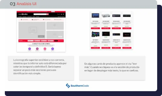
Keeping in mind the current and potential users of the product, we started our process by acquiring as much information as possible about AudioOnline. To do so, we analyzed the metrics available from the client’s website. Studying those and auditing the site through Google Lighthouse we expanded on our knowledge.
In addition, usability and design systems were taken into account, comparing the product with local and global competitors. All this information enabled us to define the main aspects of a new design system along with the must-haves.
b/ User Personas
Empathizing with the user
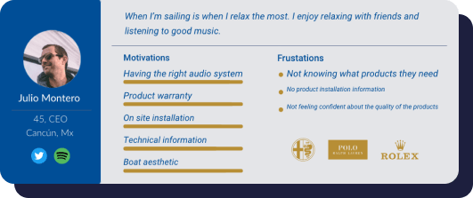
The next step was to define as precisely as possible who the users of AudioOnline were. Based on demographics, online behavior, and user voice from sales and social media platforms interaction along with interviews, a clear picture was formed.
From there, we were able to define the main insights of the two main user groups - Car Audio and Marino/RZR customers.
Ideation and Design
a/ User Flows
Once the main definitions were made, we started defining the user flows, with special emphasis on the process that compromises the search for a product and finishes with the purchase. Special care was put forward to ensure that the purchase flowed smoothly, from matching the users with the best option available to guaranteeing security throughout. By applying these changes, the conversion rate would go up.

b/ Design System
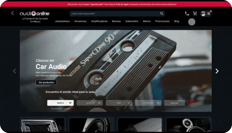
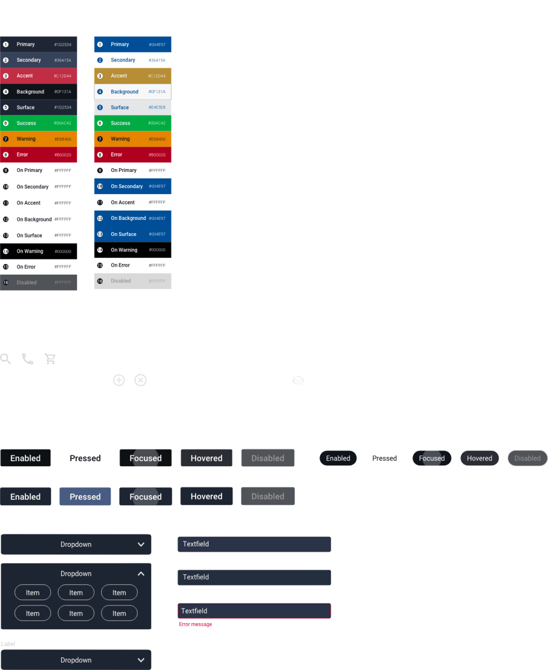
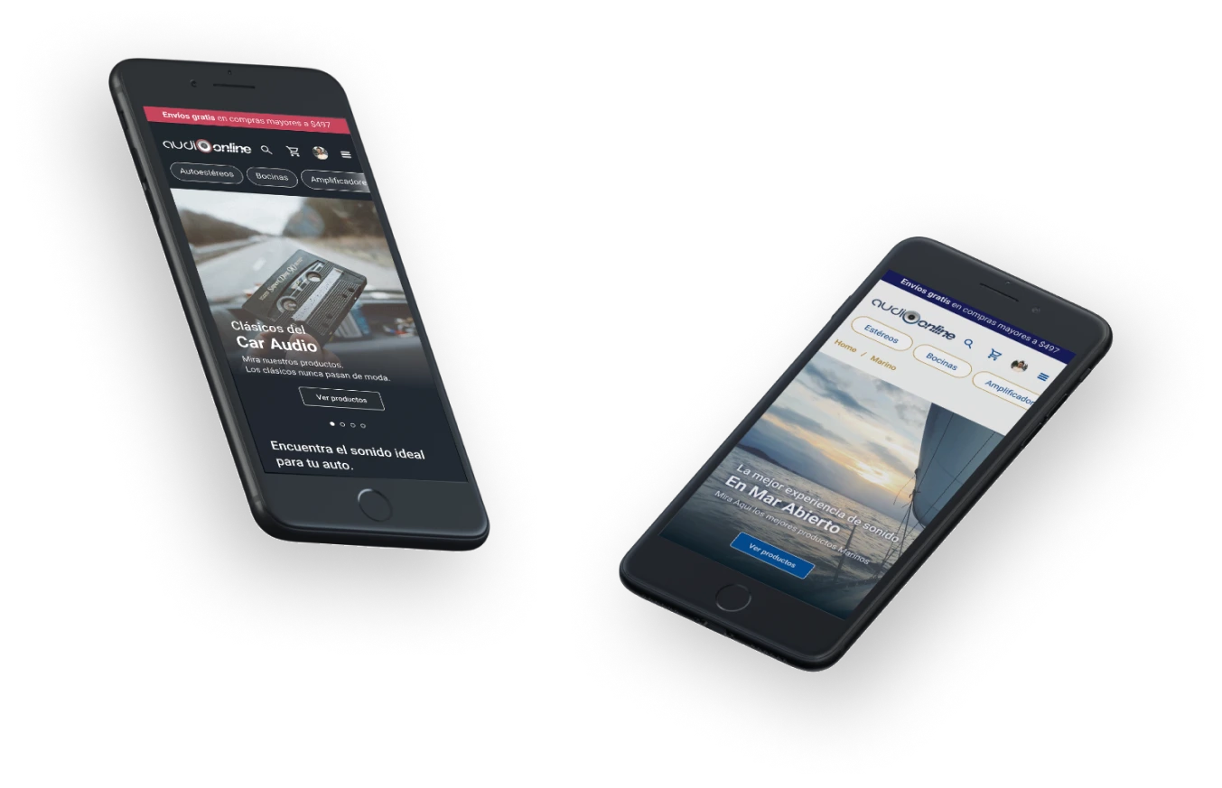
As two main groups were defined, our team considered it necessary to define a design system that could be applied for both while differentiating a few elements and colors for each.For Car Audio a dark background with blue-gray accents - hinting at technology and cars - was proposed, while for Marino and RZR bright colors with navy blue and gold accents would take center stage.
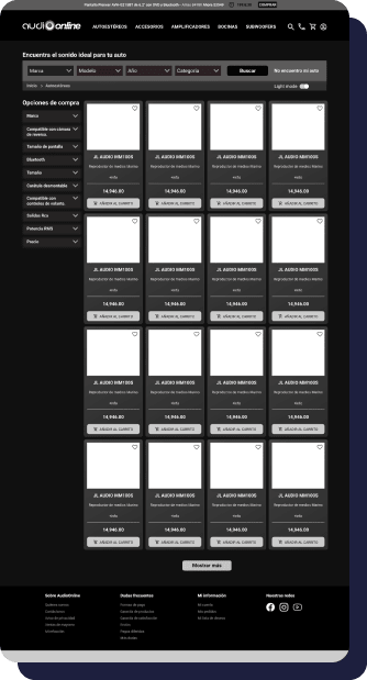
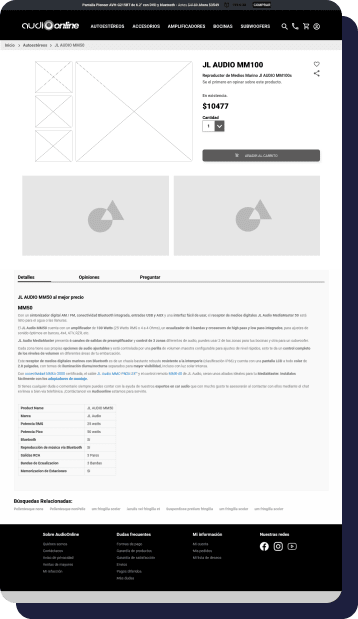
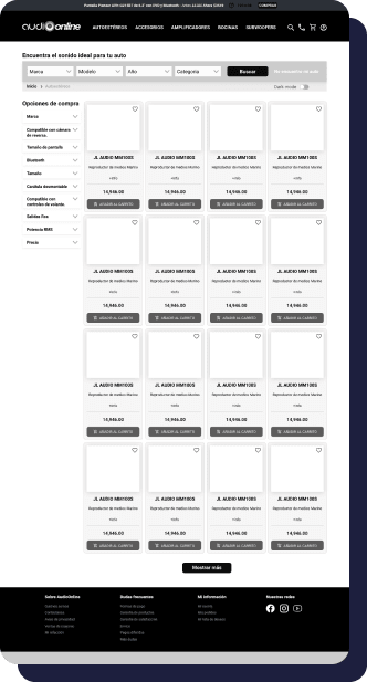
c/ Lo Fi & Middle-Fi Wireframes
The redesign of the site was organized into different sections that were revised along with the client to ensure its functionality when every sprint was done. This division allowed for quick feedback, fast testing and a minimized risk of failure.
Final Proposal
a/ On Land or Sea
The final design took form introducing an improved flow and new design system. The solution was a single platform with individual features for Car Audio and Marino customers. A differentiated value proposition, high quality images and designed to make shopping a pleasant and relaxing experience.
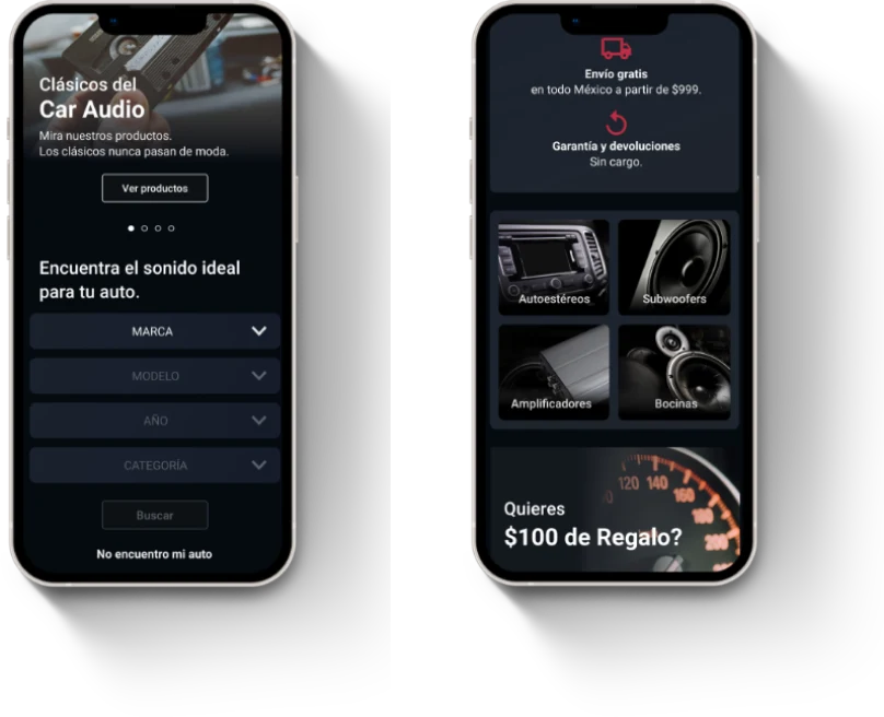
b/ Home
With a sober and elegant aesthetic, the new homepage offers a discerning value proposition and an added feature to determine whether a specific product could be compatible with a user’s car, matched with a tone that’s both friendly and respectful. The home also allows users to navigate to the most relevant sections of the website, including Marino - with visually opposite but complementary qualitative aspects.
At the top of the home page we find the “Automotive compatibility feature”, to check if the products will fit in the user’s vehicle. Depending on the characteristics and importance of each product, we have different cards to hierarchize those of greater relevance.
c/ Discovering the Products
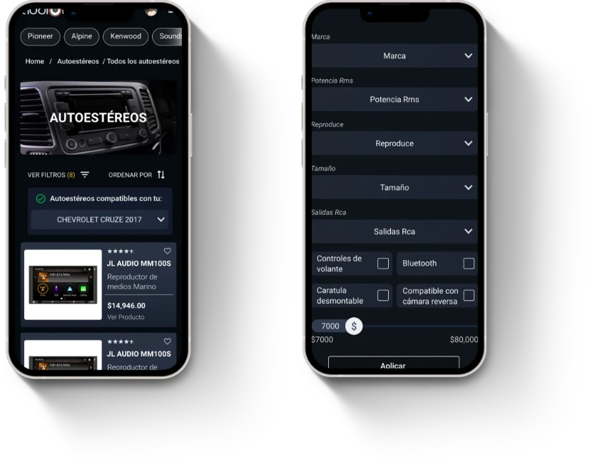
Consumers of this specific type of product are quite knowledgeable, always researching before making a purchase. That’s why the products are divided into categories and presented in the form of cards that offer summarized and clear information as well as filters to search for specific features faster.
The product listing allows to filter by usage or technical characteristics and to check compatibility with vehicles.
d/ Finding the Right One
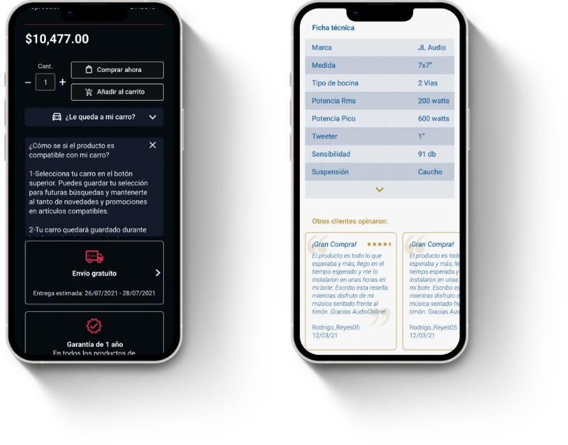
The product page was designed to help the users in their decision making. By dividing the data available of a given product into two columns - on the left a list of the product’s features and on the right information regarding the payment and shipping - all doubts regarding the product aim to be dispelled while promoting the purchase.
The information on the product page is clear and is divided according to whether it is about goods or about purchases.
e/ Going Out Full-Handed
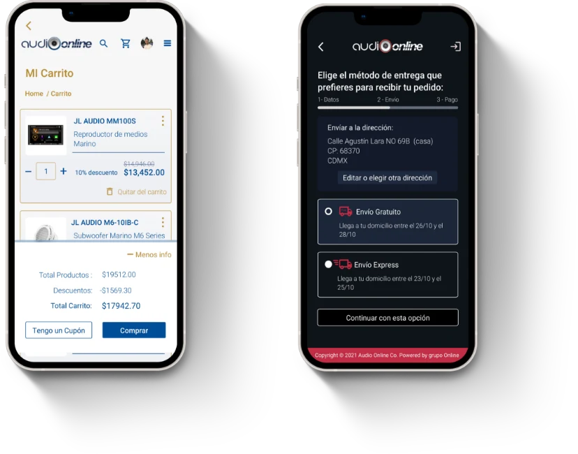
The revised and improved check-out takes the customers step by step with a linear, smooth, friendly and non-disruptive design so that AudioOnline’s clients are sure that they are acquiring the products they so wish.
The checkout process has the right information and a flow that leads the customer forward but in a smooth way, favoring the purchase decision.
f/ Development and Testing
Once all epics were completed and no major issues found, the MVP was then moved to a pre-production environment for the client to have hands-on experience before shipping it to live.
